Dev-log 1. Bike Un-Friendly: Prototype

Before I got feedback on my GDD, I knew for my prototype I had to prioritize the main mechanic of my game: pedaling. I needed to see if pedaling in my game would be as fun and intuitive as I thought, because it was fundamental to the game's unique gameplay experience and challenge, and that's what the player would be doing nearly all the time.
After having my GDD reviewed, two pieces of feedback stood out to me: to be cautious of having 2D sprites and 3D objects in the same environment because their aesthetics may clash, and to consider how my game's level design will ease players into the changes that further levels would introduce. Because my MVP would only have one level, I decided not to prioritize prototyping the level changes and pacing in my prototype; I would focus on the pedaling mechanic and look of the game.
Around that time, our professor explained some of the benefits of paper prototypes in testing a game's dimensions, including the dimensions of objects relative to each other. Because paper could be flat or folded up to create something more 3-dimensional, I thought about making a paper prototype to test the spatial feel, appearance, and player view of my game by using paper for 2D sprites and folded paper for 3D objects. This, of course, would mean I wouldn't really get to test out pedaling, so I didn't pursue this idea, and decided to create my prototype in Unity. However, that did give me the idea to approach my prototype as though I were making it out of paper.
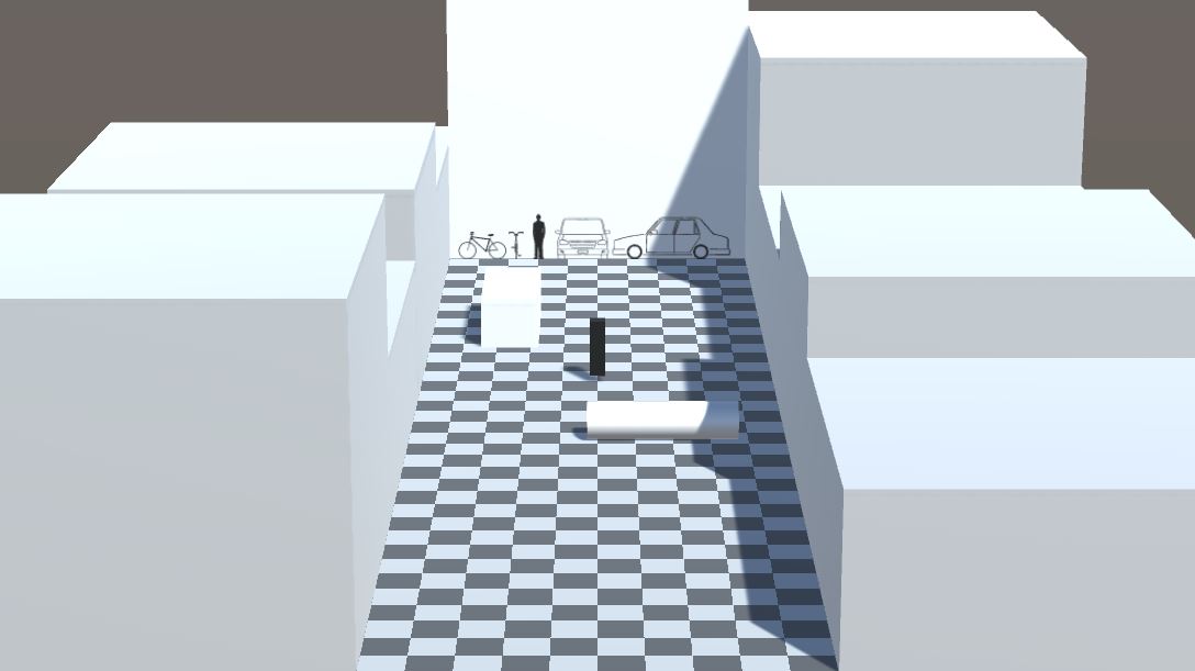
I began my prototype by sketching a few images in Affinity Photo. One was a simple 10x10 checkerboard that I could place over Unity's plane objects to better see the grid of Unity units. The other image was another square image, but it had the silhouettes of a bike, a person, and a car to scale with Unity's units and each other. I called this image the Game Dimensions Billboard.
I had made both images into squares so that I could easily import them to Unity and use them on planes as walls or floors. I used the checkerboard for the ground, and I used the Billboard as a wall from which I used to measure and create basic geometric objects representing the player character and car obstacles.
With the Billboard and checkerboard floors, I got to work creating the playable space of my game. I began by messing with my camera’s settings: position, rotation, and field of view. I knew I wanted my game to have 3D depth, but I wanted the amount of distortion to be low, almost orthographic or 2D. I’ve seen this effect achieved in photos where subjects are far away, but the camera is zoomed in enough to fill the frame with them, so I moved my game’s camera position away, angled it down, and lowered its fov.
From there I was able to visualize and create the playable space of my game by building it within the frame of my camera. I moved the Billboard away from the camera to act as the furthest boundary the player could reach, and I made floors that extended from the billboard to the bottom of my camera’s frame. I tweaked the camera’s settings and the game objects as needed to make sure the camera could capture the top of the Billboard and the bottom of the floor closest to the camera. Capturing the top of the Billboard was important because I want my players to be able to see somewhat ahead and above their player character. Things like traffic lights, or entrances to different levels, and maybe even the sky would utilize that space and provide information about incoming obstacles, incoming branching paths, and the time of day and weather. I added basic blocks of varying sizes to the sides of the playable space to act as buildings and barriers.
The next step was the pedaling mechanic and player controller. For the purposes of the prototype, I didn’t concern myself with making neat or efficient code. I spammed “if” statements everywhere. I knew I wasn’t going to have time to develop the limitations, combos, and nuances of this mechanic, so I decided for the player controller to focus on the fundamental idea of having two buttons that would both steer and push the player forward. To do this, I chose to use the “A” and “L” keys on the keyboard for the left and right pedal respectively, and had Unity’s physics system apply a constant force forward anytime one of those keys was pressed. Simultaneously, an acceleration force was applied to the left when the “A” key was pressed, and an acceleration force was applied to the right when the “L” key was pressed. I messed with different force modes before arriving at those, as they most accurately conveyed the movement I wanted the pedaling mechanic to have. To convey the sense that the camera is scrolling up, I added another force that would push the player backwards, and clamped the player’s -Z velocity so they wouldn’t move backwards uncontrollably fast.
The basic pedaling mechanic worked as I expected, so I moved on to creating the obstacles. For the prototype, I created two obstacles for two purposes: a car that can’t be jumped over, and a log that can be jumped over. Logs don’t even exist as an obstacle in the GDD of this game, but I didn’t have time to create a pothole, so the log is there to take its place for the sake of giving the player something to jump over. I created a simple script that set their -Z velocity at a constant speed, and attached it to both objects.
I then created a simple spawner. With three empty game objects, I used two to create the left and right boundaries of where objects could spawn, and I used the third game object as the spawner that would move at a random position between the boundaries before instantiating an obstacle on a timer.
I tweaked some variables with the player’s forces and obstacle’s velocities, and finished the prototype.
While the prototype is definitely a prototype – it's incomplete – I was happy with the information I was able to get by testing some ideas, and I already plan on making a few changes to my GDD. The camera, for example, I may have follow the player by rotating and changing its fov slightly as the player moves up and down the playable space. This would be to fill more of the screen space with the playable space, because in the prototype, the playable space takes up less than 1/3 of the screen.
Get Bike Un-friendly: Unusually Friendly Edition
Bike Un-friendly: Unusually Friendly Edition
A endless runner game about biking down a city's long and empty alley.
| Status | On hold |
| Author | Andrew Pena |
| Genre | Action |
| Tags | 2D, 3D, Endless Runner |
More posts
- Dev-log 3. Bike Un-Friendly: "Not-yet-a-Beta" BuildOct 24, 2023
- Dev-log 2. Bike Un-Friendly: "Programmer Art" BuildOct 10, 2023
